COVID 19 – Canada risk
COVID 19 – Canada risk
— PROJECT NAME
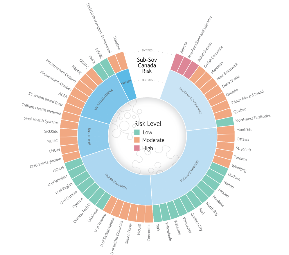
COVID19 Canada wheel chart
— ROLE
Art Direction
Data Visualization
Graphic Design
Branding
— SOFTWARE
Adobe Illustrator
MS Excel
— DATE
03/2020
A Moody’s Investors Service senior vice president analyst based in Toronto asked to redesign their Excel data and show how COVID19 affected various industries/sectors in Canada.
I decided a wheel chart design would be best to depict the different levels of data as it is modern in appearance and has the ability to summarize large volumes of information in a single graphic. Although a very time-consuming graphic to create, the feedback was highly positive as the analyst commended my efforts directly to upper management.
Base of graphic begins in MS Excel and then finalized in Adobe Illustrator to be placed into a financial research report.