
— PROJECT NAME
APAC (Asia Pacific) country comparison of 5G curve
— ROLE
Art Direction
Data Visualization
Graphic Design
Branding
— SOFTWARE
MS Excel
Adobe Illustrator
— DATE
07/2019
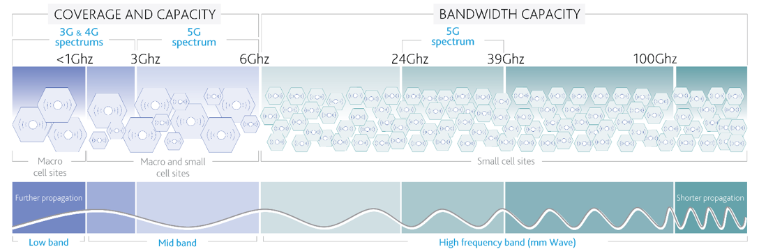
Moody’s Investors Service analysts based in Singapore requested to visualize the new 5G affect to Asian Pacific countries. Client requested two timeline infographics to depict release schedules and coverage capacities.